The pandemic has fundamentally changed the way we see the world around us. While two years ago, seeing someone in a face mask was a rare occurrence, now we’re finding ourselves avoiding those without them. Hand sanitising stations are a standard practice when we go to the shops, to work, to a restaurant. We truly are living in a ‘new normal’, and as the pandemic slows down and life opens up, things look very different. So what does that mean for brands?
There are a number of brands who have taken the time during the pandemic to re-invent themselves, emerging from lockdown with a new face to mark this new age. We’ll be taking a look at three brands who we think have come out of Covid-19 looking better than ever.
Rolls-Royce
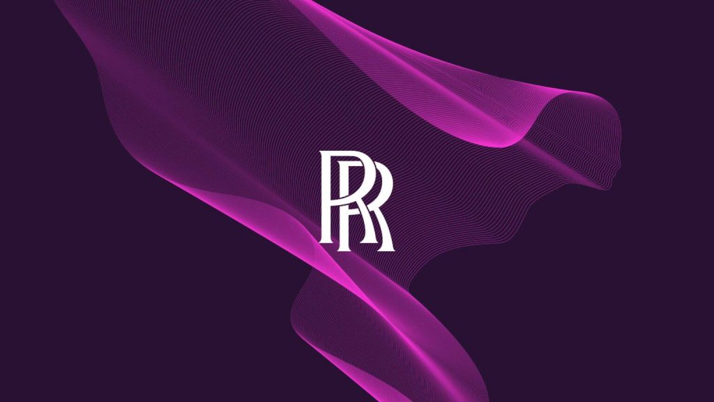
Rolls-Royce has been the pinnacle of luxury in the automotive sector for generations; built on elegance and wealth, the brand’s well-established past faced a challenge. How do you maintain the brand’s class and sophistication, while ensuring the brand stays relevant and, dare we say it, cool?
Pentagram, a multi-disciplinary, independently-owned design studio, tackled the challenge beautifully. Balancing a sleeker look with nods to Rolls-Royce’s past, they updated the Spirit of Ecstasy emblem and refined the brand’s iconic double-R monogram.
Introducing a new, purple palette, their colour selection perfectly complemented traditional royalty and wealth with a gender-neutral, funky choice, appealing to the masses. Overall, it’s a beautiful rebrand that welcomes younger generations into the lap of luxury, a true emblem of the new age.
Zoopla
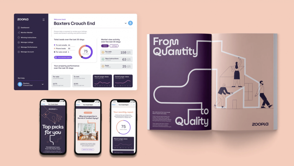
Zoopla is another brand that has taken the time during the pandemic to redefined their branding in line with an updated brand ethos.
Brand consultancy Zag has designed the new look, which comprises an updated logo, change in the signature colour as well as a new visual system. The studio was briefed to “help Zoopla get its mojo back”, Cummings adds, and to incorporate “that human spirit, joy, warmth and playfulness that the competitors don’t have”.
Moving away from angles, Zoopla has embraced a more fluid and rounded design language in what they are describing as their ‘Journey Lines’ concept. According to Zoopla design lead Gabriel Weichert, the complexity of the house-buying process is “reflected in the range of forms; sharp turns and flowing curves and the combination of upper and lower case characters”.
Zoopla’s rebranding arguably was led from a desire to bring the brand’s ethos to the surface, putting their best face forwards and showing they truly understand their audience.
Midol
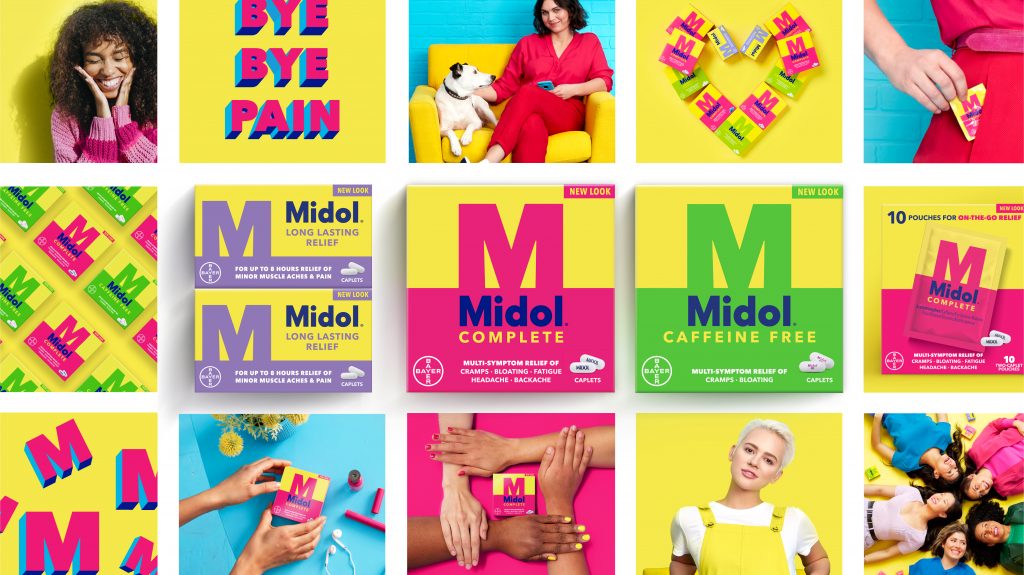
Midol, established in 1938, hadn’t adapted their branding to the times. When they held a survey among a random selection of the public, it was found that the brand was so far from the public connaissance that people couldn’t even remember the colour of their packaging. To remedy this and reintroduce the brand to younger generations, Midol launched a fun, modern, and inclusive campaign, using diverse models and creating some truly unique packaging.
Using a bolder palette, the brand belief in pain-free living being synonymous with joyful and fun living, comes through from the outset. Similarly, the bold typography reflects a far stronger stance than their previous dainty font. A bold choice for the bold, modern woman, this is not your mother’s Midol, and we think that’s a great thing.
Want to get creative with your brand and think Wonderhatch can help? Pop us an email at hello@wonderhatch.co.uk or fill in your details and we’d love to see how we can make that a reality.