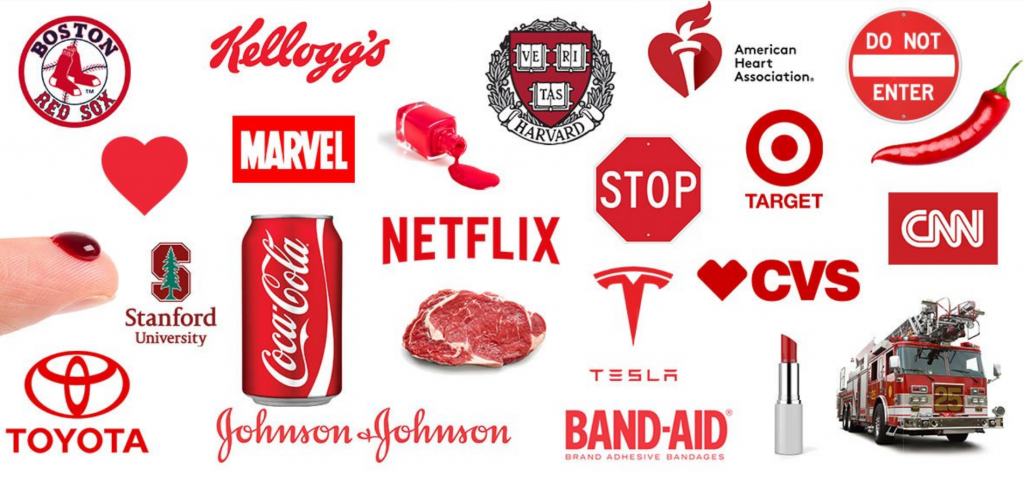
Colour matters. Google famously ran an AB study to choose from 40 different shades of blue for their advertising link. We would like to examine how red can be used to signify different things in advertising and marketing. Red is exceptionally powerful and attention-grabbing. It is omnipresent in car ads, company logos, and of course its use in F&B and Hospitality.
Let’s examine a few different ways of how red is being used:
Why is it so common and versatile? Is it because its meaning can be synonymous with love, anger, blood, sex, warning, danger, power, energy, and so on? One of the first things that usually comes to mind when thinking of red is a stop sign. Companies don’t want to associate their product with a warning so why use the color to represent that?
Red is about attention, demanding its audience to stop and look. Red pulls on our attention for danger and twists it to something exciting, possibly naughty, pleasurable, and possibly expensive. It can represent what we want and can’t have, which only makes us want it more. Now let’s move on to some examples:
-
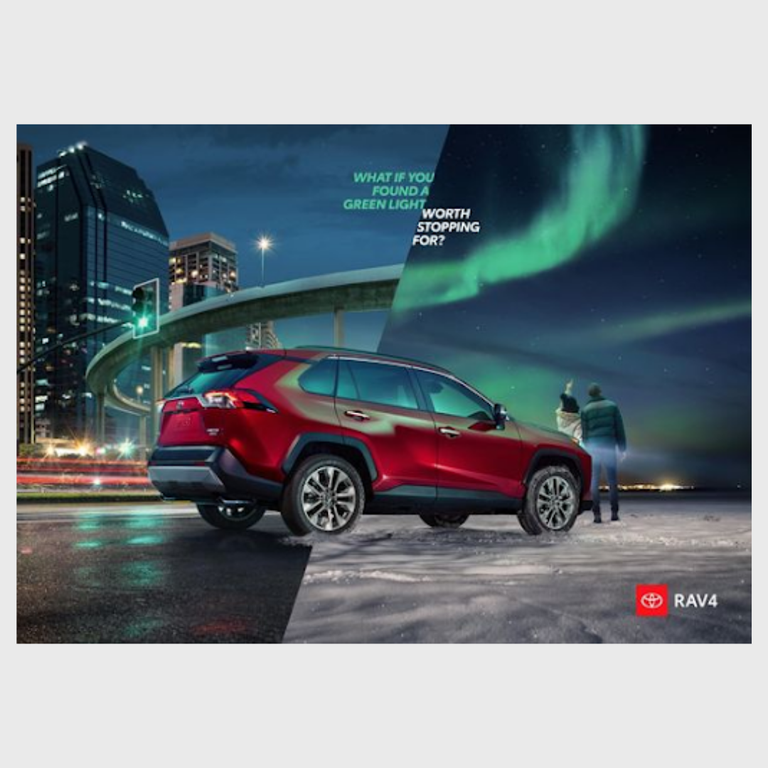
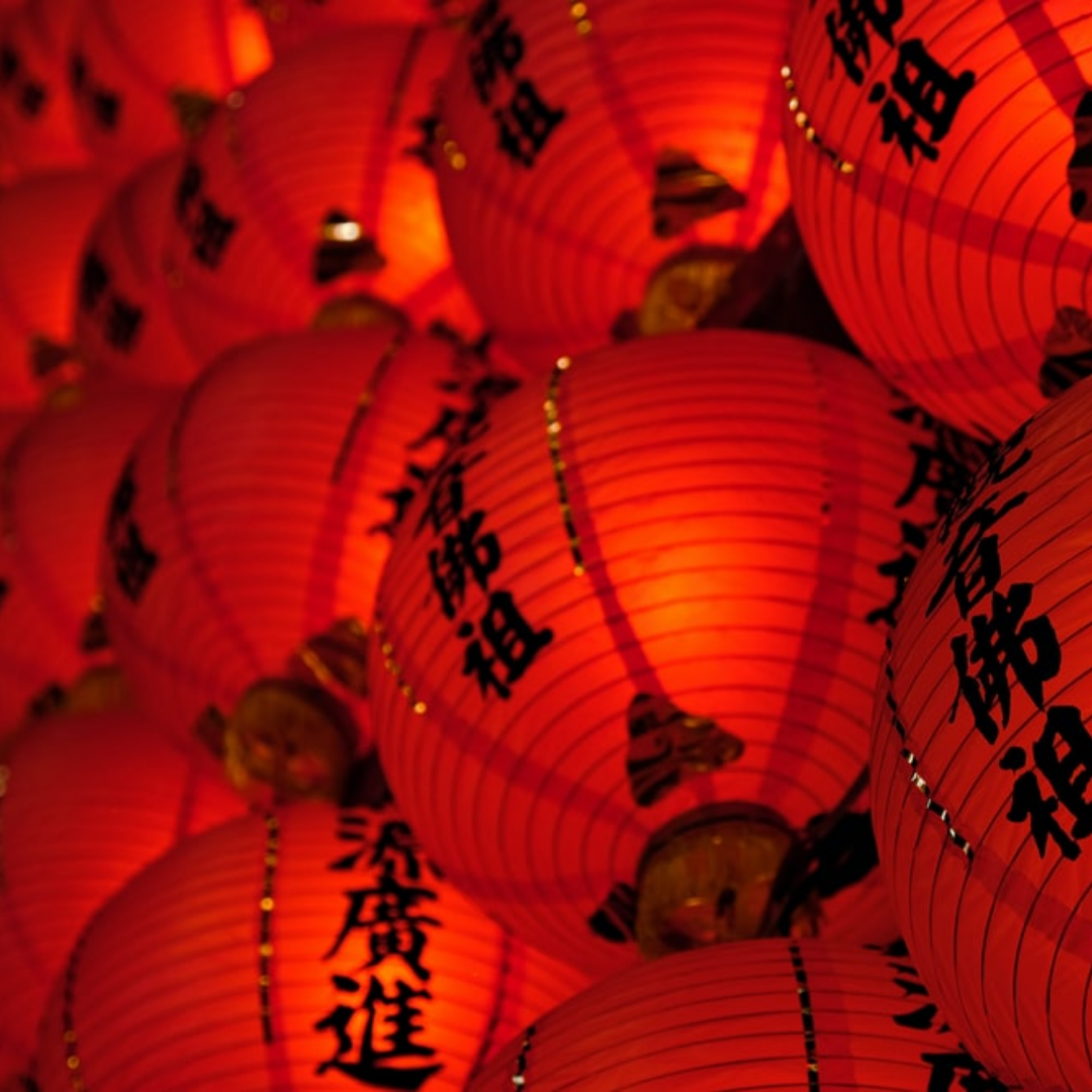
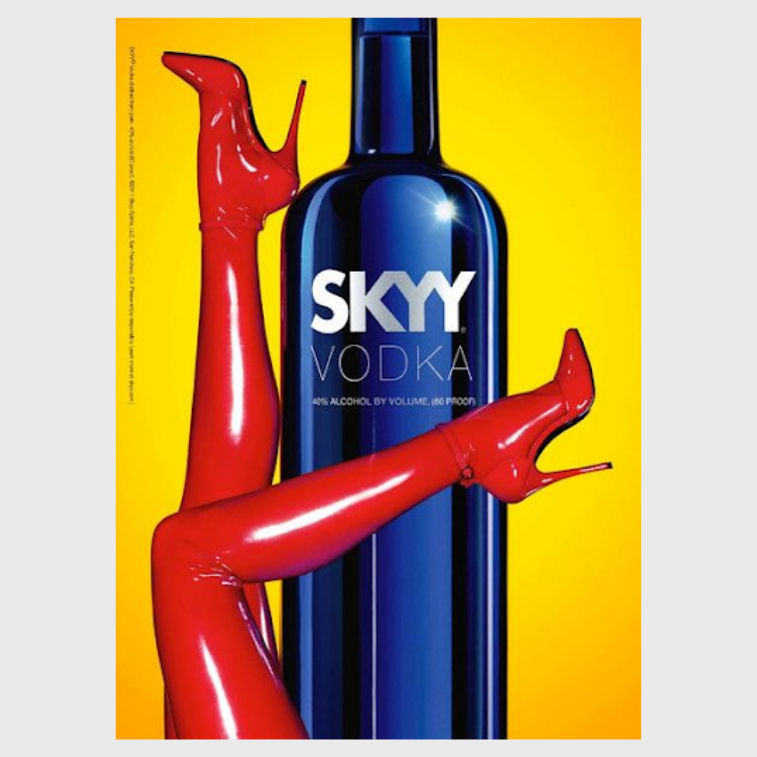
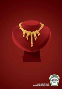
- Power, status, wealth, reputation
-
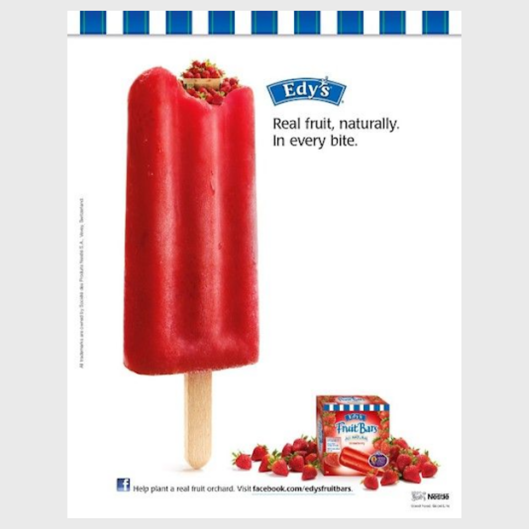
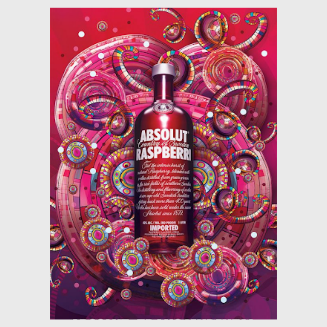
- Health, freshness, enjoyment
-
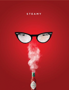
- Sex, alluring, spicy, charisma
-
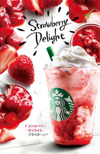
- Spice, delight, excitement
Why such strong characteristics all of one colour?
Then we have –  – the official symbol of danger and warning? Not sex? Not fruit?
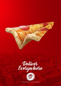
Red in F&B is enticing, slightly off the usual menu, maybe it’s tangy, spicy, sweet, it’s abnormal and we want it.
Red is a great colour to go for a visual motif, but one must be careful to ensure that the right shade is chosen to communicate exactly what we want with the customer.
Indulgence is part of human nature, thus marketing something as risky (tabasco), extravagant (heinz) or accessible (pizza hut) is what red does best. It gives us that excuse to splash out, red is the voice in your head saying “go on, it’ll be worth it”, a voice that’s no stranger in the world of advertising. Food especially benefits well from the concept of red, indulgence is one of the best parts of dining after all.
References:
https://imagibrand.com/wp-content/uploads/2014/04/Red-Infographic.jpg
https://www.pinterest.co.uk/ColoradoBahamas/food-drink-advertising/
https://www.webadeptuk.com/googles-50-shades-blue-web-design-matters/
https://www.verywellmind.com/the-color-psychology-of-red-2795821
Written by Alice Constance, Photo Editor at Wonderhatch, and Justyna Siodlowska, Film Producer at Wonderhatch
Think you’ve got something to add to TAH? Pop us an email or leave us a comment below!


